Greetings, fellow data enthusiasts! Are you ready to unlock the power of Google Analytics 4 by visualizing your data in BigQuery using Data Studio? This comprehensive guide will walk you through the essential steps to connect your GA4 data with BigQuery and then create dynamic visualizations in Data Studio. By the end of this post, you will be equipped with the knowledge to harness the potential of these powerful tools to gain valuable insights and make data-driven decisions for your various business endeavors.
Understanding Google Analytics 4 and BigQuery
Before we dive into how to visualize Google Analytics 4 data in BigQuery using Data Studio, let’s take a moment to understand the key characteristics of Google Analytics 4 and get an overview of BigQuery as a data warehouse.
Key Characteristics of Google Analytics 4
With the release of Google Analytics 4, businesses now have access to a more advanced and powerful analytics platform that provides a deeper understanding of user behavior across multiple devices and platforms. This version focuses on customer-centric data measurement and analysis, allowing organizations to gain insights into the entire customer journey, from acquisition to retention. With its enhanced event-based tracking and machine learning capabilities, Google Analytics 4 empowers businesses to make data-driven decisions and drive growth.
// Example of event-based tracking in Google Analytics 4
gtag('event', 'login', {
  'method': 'Google'
});
Overview of BigQuery as a Data Warehouse
Data warehousing is essential for storing and analyzing large volumes of data, and BigQuery excels in this area. It is a fully managed, serverless data warehouse that allows for seamless scalability and high performance. With its ability to handle petabytes of data and execute complex queries quickly, BigQuery enables organizations to derive valuable insights from their data. It also integrates seamlessly with other Google Cloud products and services, making it an ideal choice for businesses looking to leverage their data effectively.
# Example of running a query in BigQuery
SELECT
  customer_id,
  SUM(total_revenue) AS total_purchase_value
FROM
  transactions
GROUP BY
  customer_id
ORDER BY
  total_purchase_value DESC;
Characteristics such as scalability, performance, and seamless integration with other Google Cloud products make BigQuery a powerful tool for organizations seeking to harness the full potential of their data.
Preparing Data in BigQuery
Any Google Analytics 4 data that you want to visualize in BigQuery using Data Studio needs to be properly prepared in BigQuery first. This involves creating and configuring the necessary datasets and tables to ensure that your data is structured in a way that is conducive to analysis and visualization.
# Create a new dataset in BigQuery
bq mk new_dataset
Exporting Google Analytics 4 Data to BigQuery
On the Google Analytics side, you can export your Google Analytics 4 data to BigQuery by linking your Google Analytics property to a BigQuery dataset. This allows for the seamless extraction of Google Analytics 4 data directly into BigQuery, where it can then be accessed for further analysis and visualization.
# Link Google Analytics property to BigQuery dataset
Tips for Structuring Your Data for Analysis
Google Analytics 4 data can be complex and multi-dimensional, so it’s important to consider how to structure your data for analysis in BigQuery. By properly organizing and formatting your data, you can ensure that it is optimized for easy and efficient analysis, ultimately leading to more insightful visualizations and informed decision-making.
- Use SQL queries to reshape and aggregate your data
- Organize data into logical and normalized tables
- Consider partitioning and clustering for improved performance
This approach will enable you to confidently dive into your Google Analytics 4 data, knowing that it has been structured in a way that is conducive to in-depth analysis and visualization.
# Example SQL query to reshape and aggregate data
SELECT
  date,
  COUNT(*) as pageviews
FROM
  ga_table
GROUP BY
  date
Visualizing Data with Data Studio
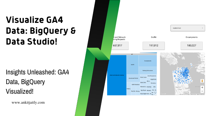
Despite the data being stored in BigQuery, it is often necessary to present it visually to make it understandable for a wider audience. Data Studio is a powerful tool that allows you to create interactive and informative reports and dashboards using your Google Analytics 4 data. With Data Studio, you can connect directly to your BigQuery dataset and visualize the data in a matter of minutes.
// Sample code for connecting Data Studio to BigQuery
function connectToBigQuery() {
  // code here
}
Types of Visualizations in Data Studio
Data Studio offers a wide variety of visualization options, including bar charts, line charts, pie charts, tables, and geo maps. Each type of visualization serves a different purpose, so it’s important to choose the right one based on the nature of your data and the story you want to tell.
// Sample code for creating a bar chart in Data Studio
function createBarChart() {
  // code here
}
- Bar charts are effective for comparing data across different categories or groups.
- Line charts are useful for showing trends in data over time.
- Pie charts are great for illustrating the proportion of each category in the data.
- Tables are helpful for displaying detailed data in a structured format.
- Geo maps provide a geographical view of your data.
After selecting the appropriate visualization type, you can customize it further by adding relevant dimensions and metrics to convey the desired insights.
Step-by-Step Guide to Creating a Dashboard
Guide Creating a visually appealing and insightful dashboard in Data Studio involves several steps. First, you need to identify the key metrics and dimensions that you want to include in your dashboard. Then, you can begin creating individual charts and tables to visualize these data points. Once the individual elements are in place, you can arrange them on the canvas to create a cohesive and easy-to-understand dashboard layout.
// Sample code for arranging elements in a Data Studio dashboard
function arrangeDashboardElements() {
  // code here
}
| Step | Description |
| 1 | Identify key metrics and dimensions |
| 2 | Create individual charts and tables |
| 3 | Arrange elements on the dashboard canvas |
StepbyStep It’s important to ensure that the dashboard is visually appealing and easy to navigate, with clear labels and intuitive interactivity to enhance the user experience.
Factors to Consider When Designing Visualizations
Creating When designing visualizations in Data Studio, it’s critical to consider factors such as clarity, consistency, relevance, accuracy, and usability. Clarity ensures that the intended message is communicated effectively, while consistency maintains a uniform look and feel throughout the dashboard. Relevance and accuracy help in presenting meaningful and reliable data, and usability determines how easily viewers can interact with the visualizations.
// Sample code for ensuring clarity and consistency in visualizations
function ensureClarityConsistency() {
  // code here
}
- Clarity ensures that the intended message is communicated effectively.
- Consistency maintains a uniform look and feel throughout the dashboard.
- Relevance and accuracy help in presenting meaningful and reliable data.
- Usability determines how easily viewers can interact with the visualizations.
Perceiving By considering these factors, you can create visualizations that effectively convey the underlying insights and drive informed decision-making.
Pros and Cons of Using Data Studio with BigQuery
Consider Data Studio offers numerous benefits for visualizing BigQuery data, including seamless integration, real-time collaboration, customizability, and scalability. However, it also has limitations such as complexity in handling large datasets, limited data preprocessing capabilities, and dependency on Google ecosystem.
// Sample code for real-time collaboration in Data Studio
function enableRealTimeCollaboration() {
  // code here
}
| Pros | Cons |
| Seamless integration | Complexity in handling large datasets |
| Real-time collaboration | Limited data preprocessing capabilities |
| Customizability | Dependency on Google ecosystem |
| Scalability |
Dashboard It’s essential to weigh these pros and cons carefully and consider your specific use case before leveraging Data Studio for visualizing data from BigQuery.
Can I Use Data Studio to Visualize the Results of Advanced BigQuery SQL Techniques for Google Analytics 4 Data?
Yes, you can use Data Studio to visualize the results of advanced BigQuery SQL techniques for Google Analytics 4 data. Data Studio seamlessly integrates with BigQuery, allowing you to create custom reports and dashboards to display the insights and analysis generated through advanced BigQuery SQL techniques.
Advanced Visualization Techniques
For advanced visualization techniques in BigQuery using Data Studio, there are a few key strategies to consider. These techniques can help you create more dynamic and impactful reports for your team or clients. Let’s explore some of the most effective ways to visualize your Google Analytics 4 data in BigQuery using Data Studio.
Customizing Reports with Calculated Fields
Fields that are not readily available in your dataset can be created using calculated fields in Data Studio. These custom fields can be used to perform calculations, apply filters, and manipulate data to suit your reporting needs. By leveraging calculated fields, you can customize your reports to provide more insightful and relevant information to your audience.
SELECT
  event_name,
  COUNT(event_name) AS event_count,
  event_value / 100 AS adjusted_event_value
FROM
  `project_id.dataset_id.events`
GROUP BY
  event_name, adjusted_event_value;
Tips for Effective Data Storytelling
Storytelling with data involves presenting insights and findings in a compelling and easy-to-understand manner. To effectively communicate your data, it’s important to consider the narrative flow of your report and use visual elements to support your points. Incorporating storytelling techniques in your reports can significantly enhance the impact of your data.
SELECT
  user_type,
  AVG(session_duration) AS avg_session_duration
FROM
  `project_id.dataset_id.sessions`
GROUP BY
  user_type;
- Engage your audience with compelling visuals
- Highlight key insights through storytelling
- Utilize data visualization to enhance understanding
- Present data in a relatable and impactful manner
- Recognizing the power of storytelling in data presentations
Effective data storytelling is an essential skill for data analysts and marketers who rely on data to communicate insights and drive decision-making. By mastering the art of storytelling with data, you can elevate the impact of your reports and engage your audience on a deeper level.
SELECT
  device_category,
  SUM(total_revenue) AS total_revenue
FROM
  `project_id.dataset_id.transactions`
GROUP BY
  device_category;
- Engage your audience with compelling visuals
- Highlight key insights through storytelling
- Utilize data visualization to enhance understanding
- Present data in a relatable and impactful manner
- Recognizing the power of storytelling in data presentations
Conclusion
Now that you understand how to visualize Google Analytics 4 data in BigQuery using Data Studio, you have a powerful tool at your disposal for analyzing and reporting on your website and app performance. By integrating Google Analytics 4 with BigQuery and utilizing the visualization capabilities of Data Studio, you can gain deeper insights into your data and make more informed decisions for your business. With the ability to create interactive and customizable reports, you can present your findings in a visually engaging way that is easy for stakeholders to understand. This integration empowers you to uncover valuable insights and drive strategic actions based on your analytics data.